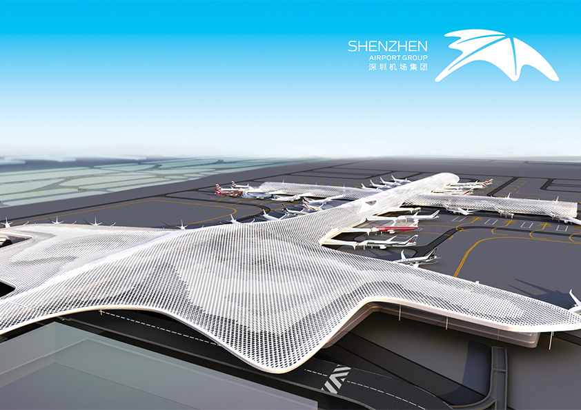
深圳机场是全国第四大机场。即将投入使用T3航站楼,由世界著名的意大利福克萨斯公司与北京市建筑设计研究院联合设计完成。T3航站楼将会成为深圳未来的重要门户形象与之一,也会成为深圳新地标。
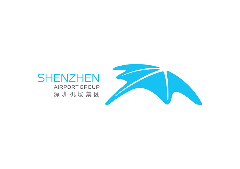
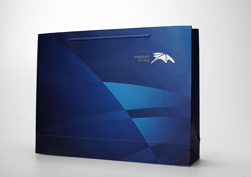
深圳机场的品牌形象将作为深圳广迎海内外游客的第一印象,体现创意与活力的城市定位。标志造型来自机场“飞鱼”外形,圆润的外轮廓也寓意环球的行业特色,代表国际交流与发展,寓意深圳机场打造国际一流的机场运营管理企业的品牌愿景。整体结构呈向上发展,具视觉引导效果,寓意企业追求卓越、积极进取、创新发展的企业文化。在T3航站楼落成之际,该形象将作为品牌形象统一集团上下18个子公司的形象。具有极强的包容性与时代感,充分体现机场集团以机场业务为核心的多元发展定位。
策略
深圳机场作为城市的门户,应该反映深圳城市精神与其独特魅力。深圳机场标志形象概念,为深圳机场T3新建筑外形,外轮廓是一个环球造型, 箭头暗示跑道,寓意航空业的国际性、交汇与发展。
流程
靳刘高设计团队在深圳机场T3新建筑实地了解并与集团高层交谈,开展创意讨论然后分别执行细分的工作,同时有配套的管理软件监控项目的进程,实现项目信息共享。
成效
随着“十二五”期间“转型”工作的推进,以今年新航站区启用为契机,深圳机场集团启动了新标志,着力建设与企业现阶段发展相适应的企业文化,打造全新的企业形象。新标志获得市民的普遍认同与游客的赞许。
新标志造型酷似“蝠鲼”,寓意机场保平安添福份,体现一座国际机场以福迎客的优质态度;标志的外轮廓是一个环球造型,寓意企业所处航空业,具有国际交流与发展的行业特色。
Shenzhen Airport is the fourth largest airport in China. T3 terminal about to be put into use is designed by the world-renowned Italian company Fuksas and Beijing Institute of Architectural Design. T3 terminal will become one of the important gateway image and a new landmark of Shenzhen in the future.
Shenzhen Airport's brand image as the first impression of domestic and overseas tourists to Shenzhen, reflects the city orientation of creativity and vitality. The design of logo is inspired by airport’s "flying fish" shape, rounded outer contour also implies global industry characteristics, representing the international exchange and development, meaning the brand vision to build a world-class airport operations management enterprise of Shenzhen Airport. The whole structure is upwards, with visual guidance effect, meaning the corporate culture of pursuing business excellence, proactive, innovative development.
In the occasion of the completion of T3, the image will be used as a unified brand image across 18 sub company of the Group. It is extremely inclusive and modern, which fully reflects the diversified development positioning of Airport Group regarding airport business as the core.
Shenzhen Airport as a gateway to the city, should reflect the spirit of the city and its unique charm. Airport’s logo image concept is inspired by Shenzhen Airport T3 terminal’s shape. The external contour is a global shape, and arrows mean runway which imply the international, intersection and development of aviation industry.
KL&K went to Shenzhen Airport T3 terminal for field trip and communicating with Group senior management, carrying out creative discussions then perform each’s work, while possessing the supporting management software to monitor the process of project to achieve the information sharing of project.
With the advance of "transformation" work during " The 12th Five-Year Plan" period, taking the opportunity of enabling the new terminal, Shenzhen Airport Group has launched the new logo, and focus on constructing a corporate culture adapt to the development of the Group at this stage to create a new corporate image. The new logo gained public recognition and praise of citizens and tourists.
New logo’s shape resembles "manta ray", meaning airport being secure and blessed, reflecting the high quality of attitude of an international airport welcoming the visitors with blessing; the external contour is a global shape, which symbolizes the aviation industry where the cooperate belong to has the industry characteristics of international exchange and development.

